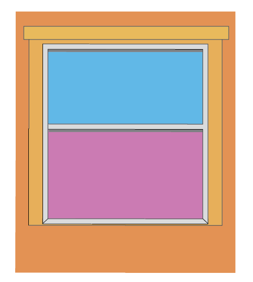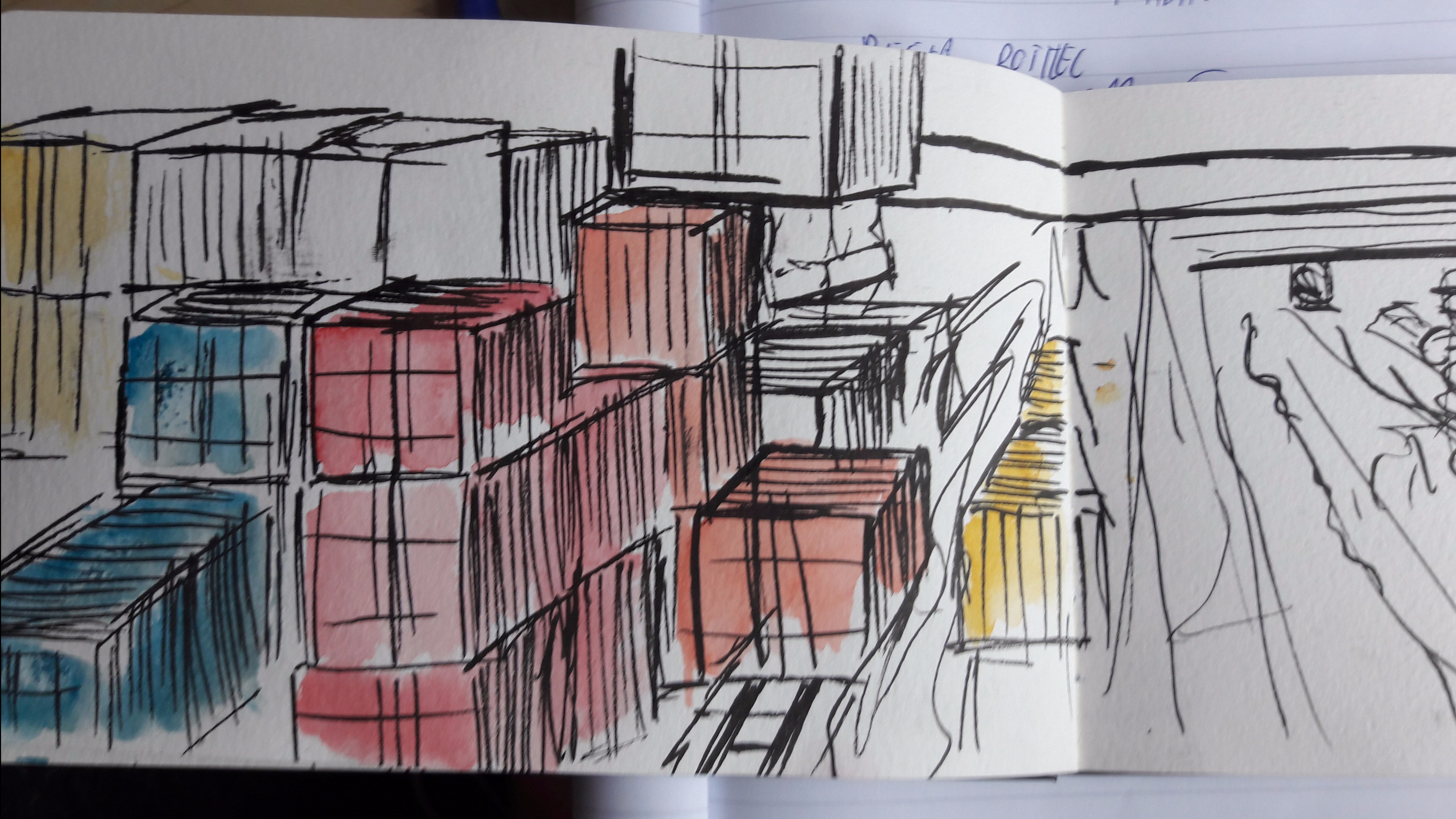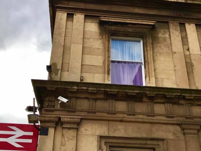
The basic idea with the Rose View bottle was to recreate the the above window. the early stages of the vector stage were spent establishing the shapes and trying to get the colour of the bottom window right. The reflection of the window was difficult to translate to a flat surface.
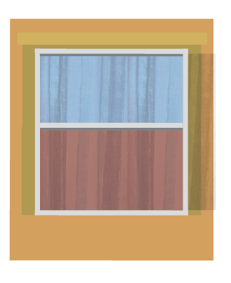
To fix this and add some depth to the window I used a photo of a curtain take from my room that looked similar to the curtains from the top photo. The curtain texture gives the image more of the impression that it is indeed a window rather than coloured boxes.
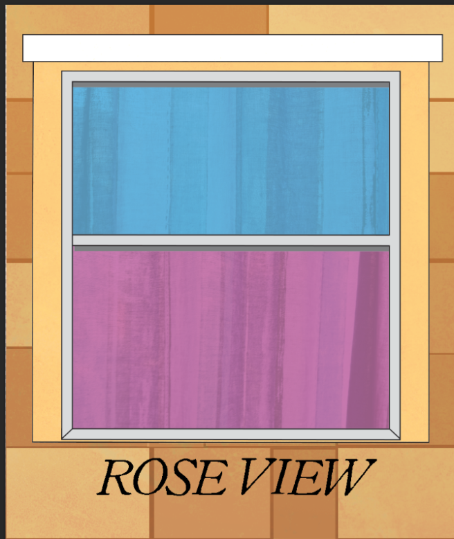
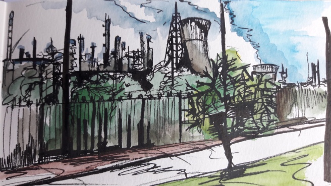
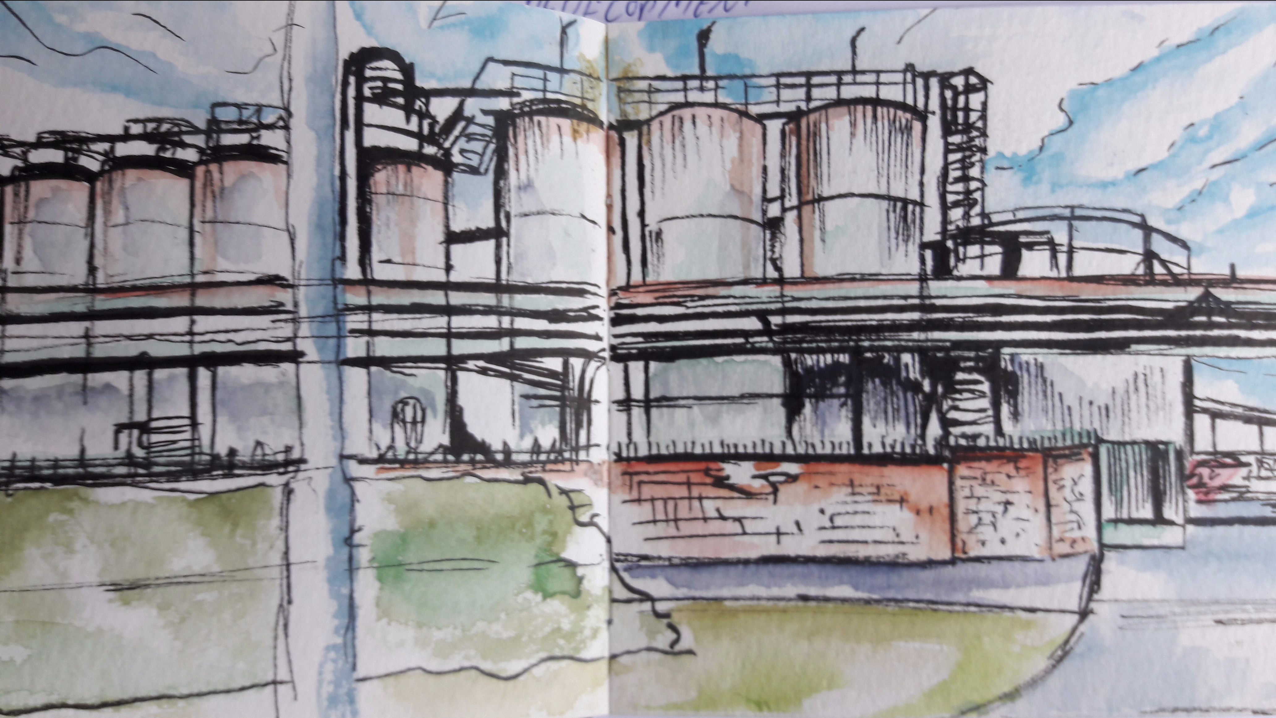
The next stage was to add the brickwork around the window as things were looking a little flat. I also added linework around the vectors surrounding the window so they stood out a little more. I think using it where I have looks fine and makes the brick work a little more subtle and remain as the background piece that it is. A mono print texture was added to the brick work to give it a bit of a gritty feel.
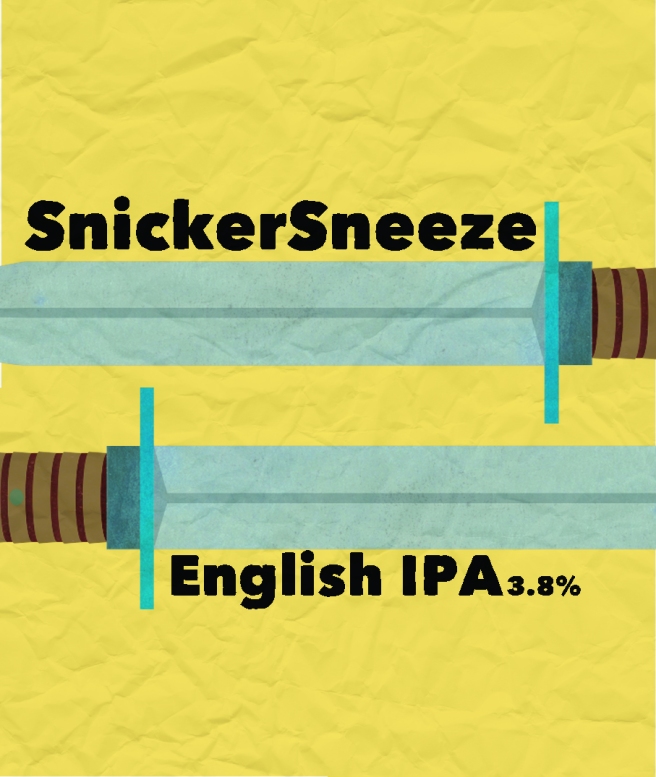
I also began experimenting with which font I would use. Other than the Italics I was happy with this style of font. It looks old like it is from some sort of street sign.
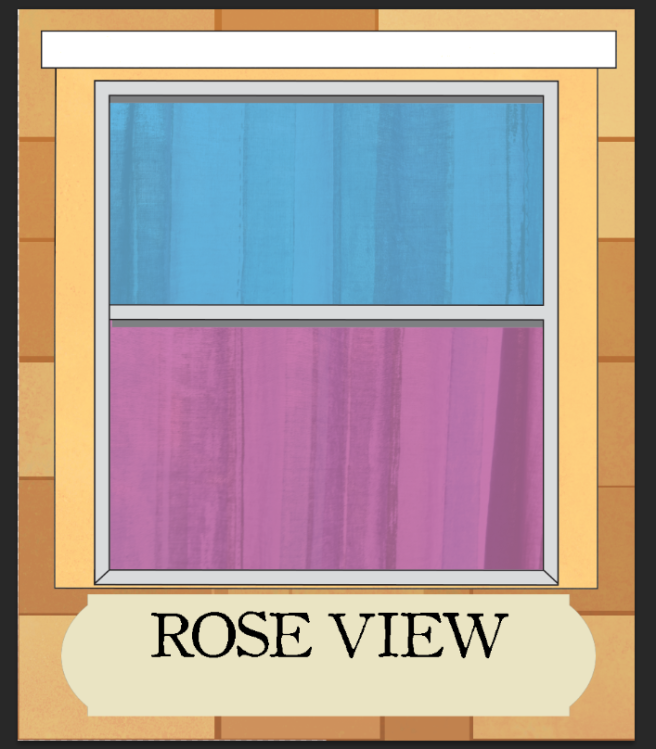
To make the text clearer I added a street sign vector behind it. It brings it up off the brickwork background that it got lost in a little. I also took it off italics which I didn’t think added anything to the piece.
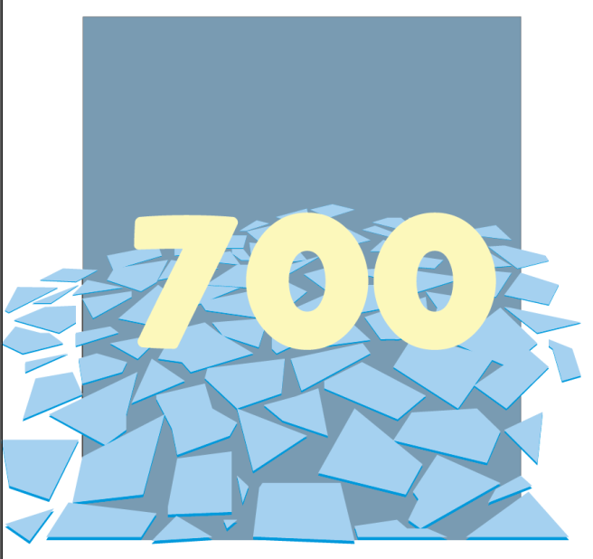
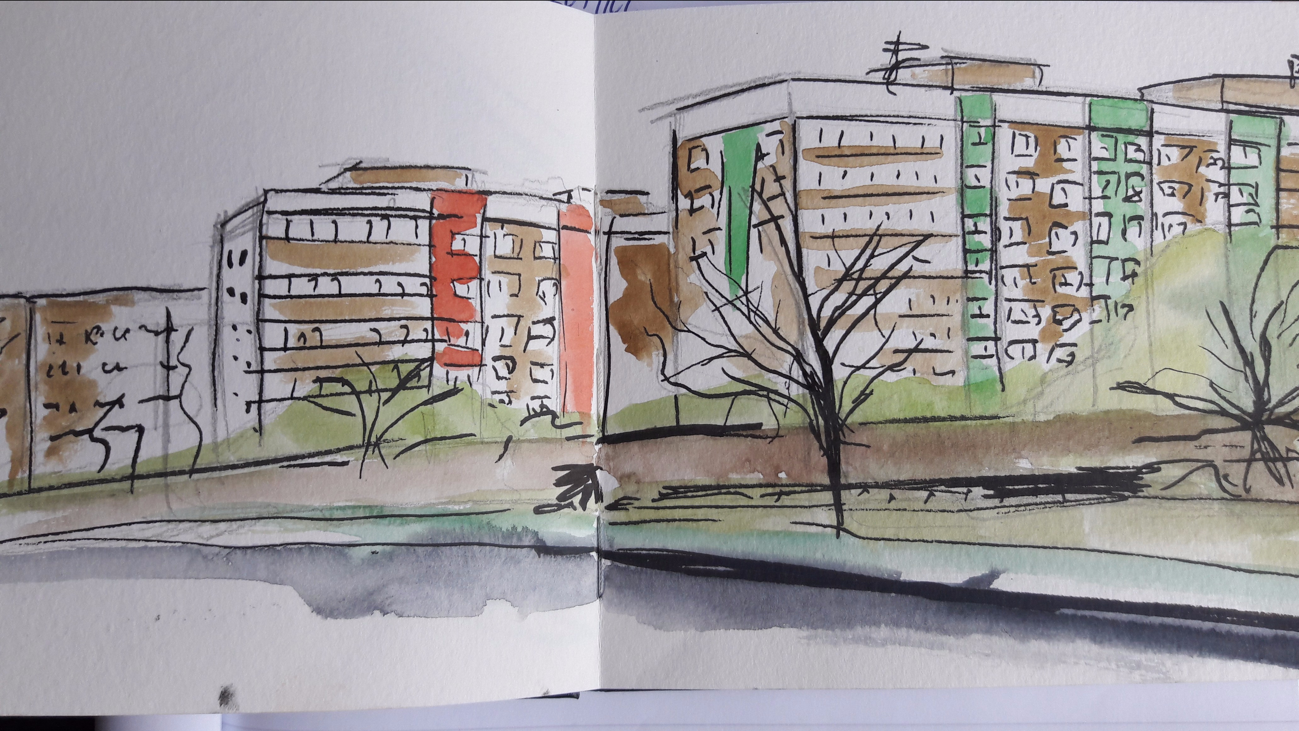
I considered having the text in the windows. This was one of the rough ideas in my sketchbook but in practice it meant that there was the empty space at the bottom of the image. A solution to this could have been making the window the whole label but this would have made it difficult to add extra information to it and it would be less identifiable as a window without the wall behind it.
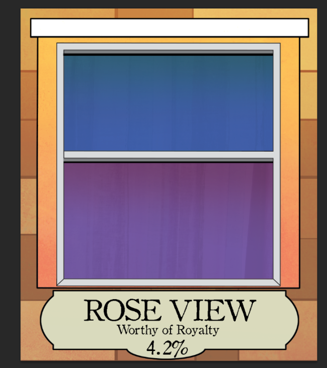
The final piece has the extra line work around the sign and an extension on the bottom to more naturally fit in the required information. I also added gradients on the window and the frame around it so it looked like light was hitting the window in a more natural way. The earlier pieces looked a bit flat whereas I think this has further developed the section into an actual window.
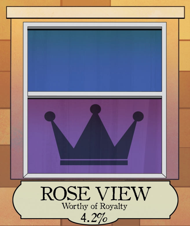
To further the Royal theme I added a crown to the window. Whilst the name references the tinting of the window all I had to mention the royal visit was the tagline underneath and text on the back of the bottle. The crown fills in the empty space and brings across the theme I wanted more.
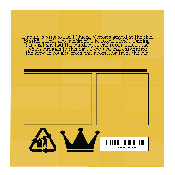
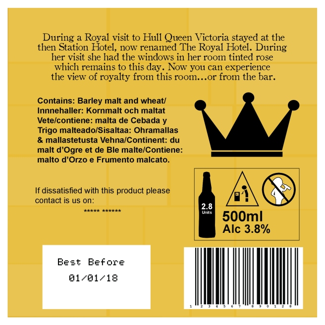
The layout of the back piece was a task of making sure the space was well filled and had the relevant information that made it look like a professional beer bottle. From the front I carried over the crown design, the font at the top and the brick background to link the pieces as part of the same label.