Cities of Tomorrow Reference Drawings

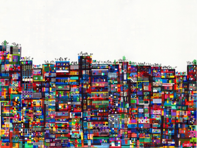
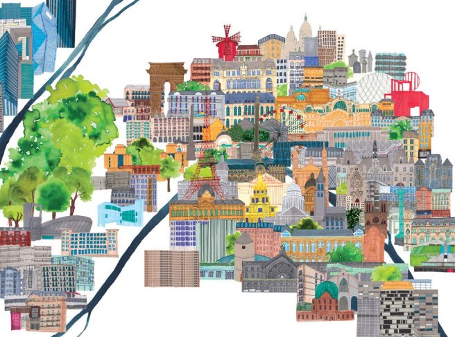
In preparation for the final cities I did some observed drawings both directly and from online images of various buildings and shapes that I would want to include in them just so I had more reference and wasn’t designing the final pieces blind.

20170626_183436

20170626_183447

20170626_183503.jpg

20170626_183509

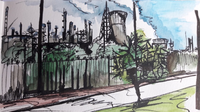
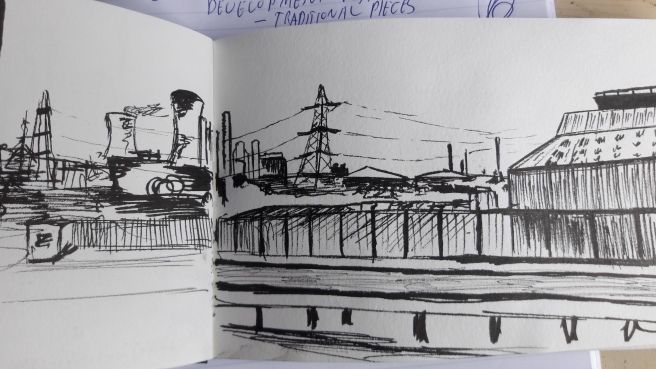
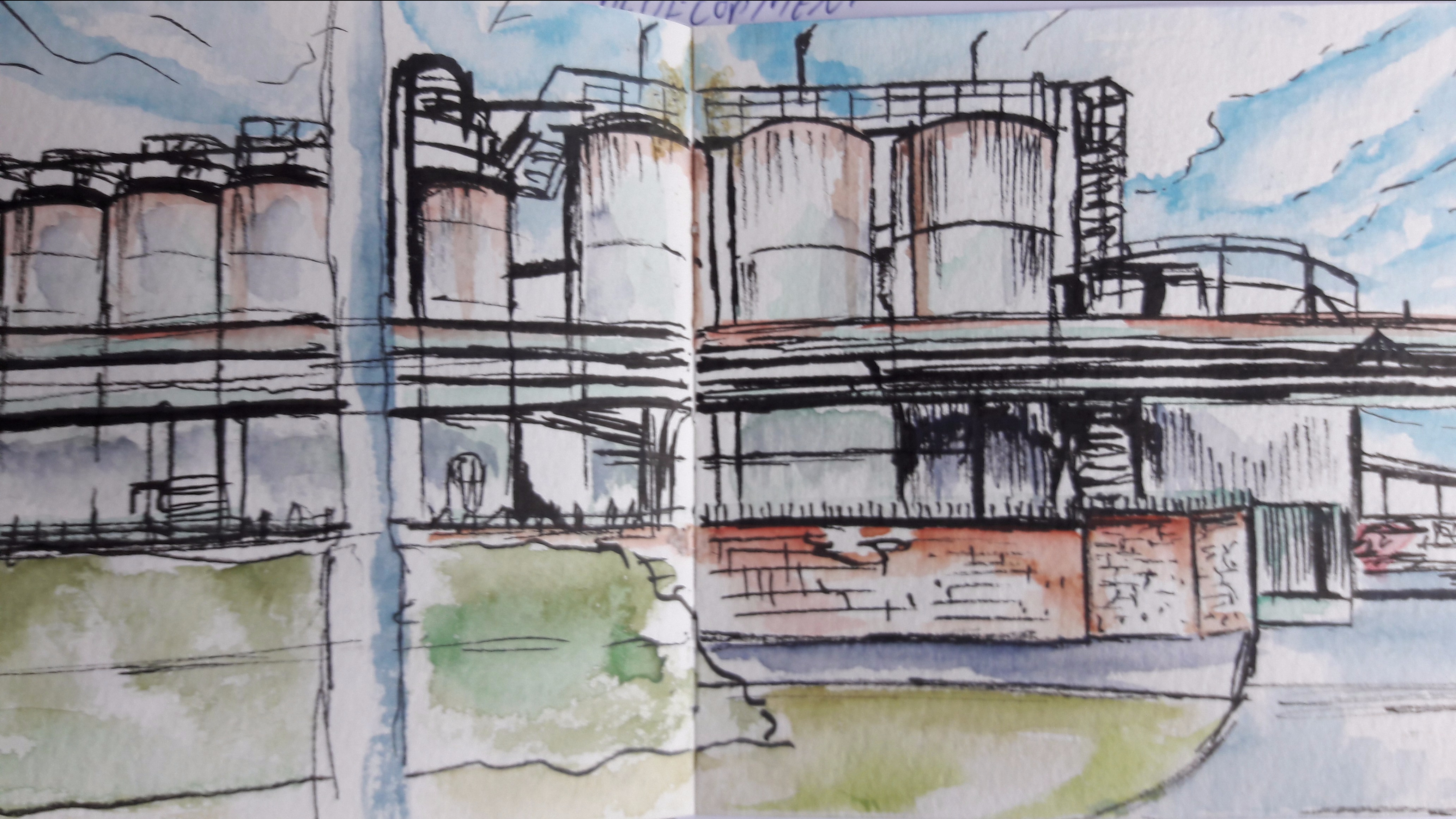
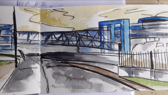
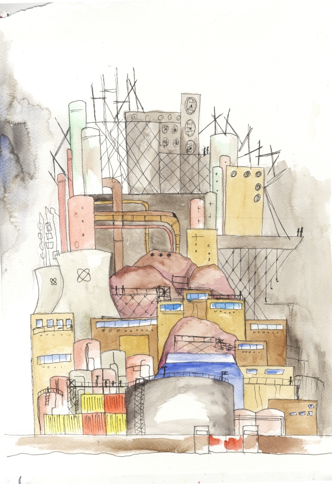
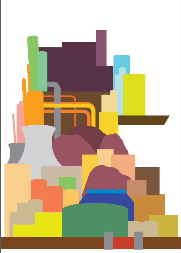
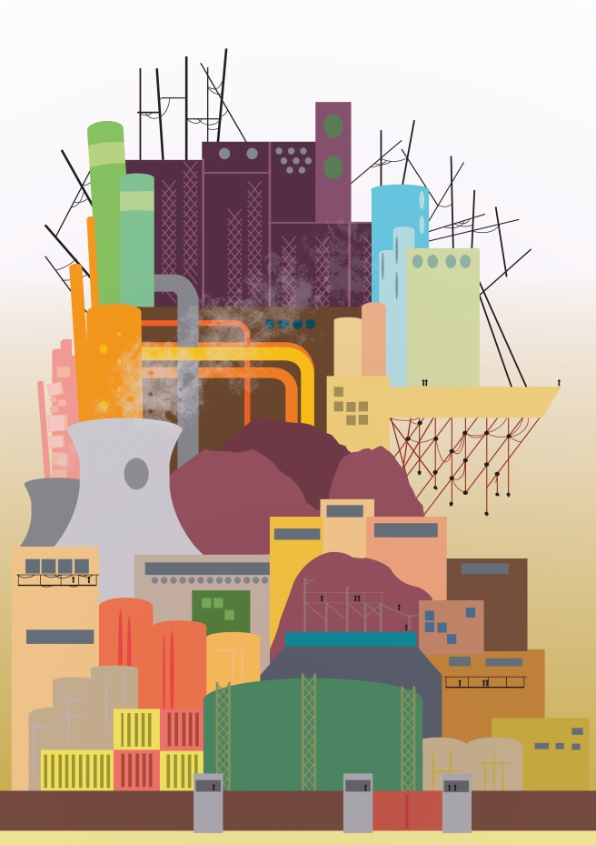
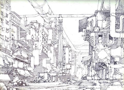
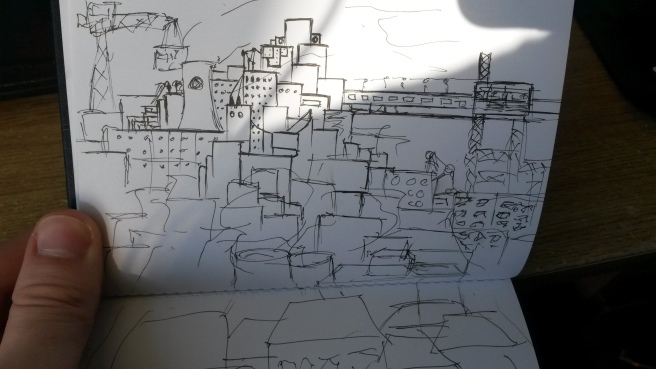
These first four were based on industrial landscapes. Early drawings of this sort of thing I found I overused cooling towers and chimneys because that is the first thing I jumped to when I thought of an industrial landscape. Whilst these are common shapes found in them you can have more subtle differences from your standard nuclear plant cooling tower.
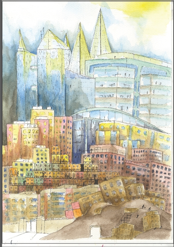
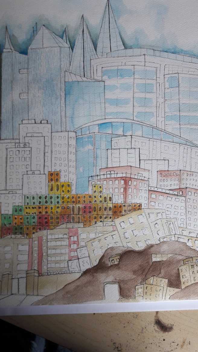
The landscapes of these four are all local buildings some of which I pass by occasionally. The familiarity helped me decide if it looked right or not.

20170626_183528.jpg

20170626_183520.jpg

20170626_183535.jpg

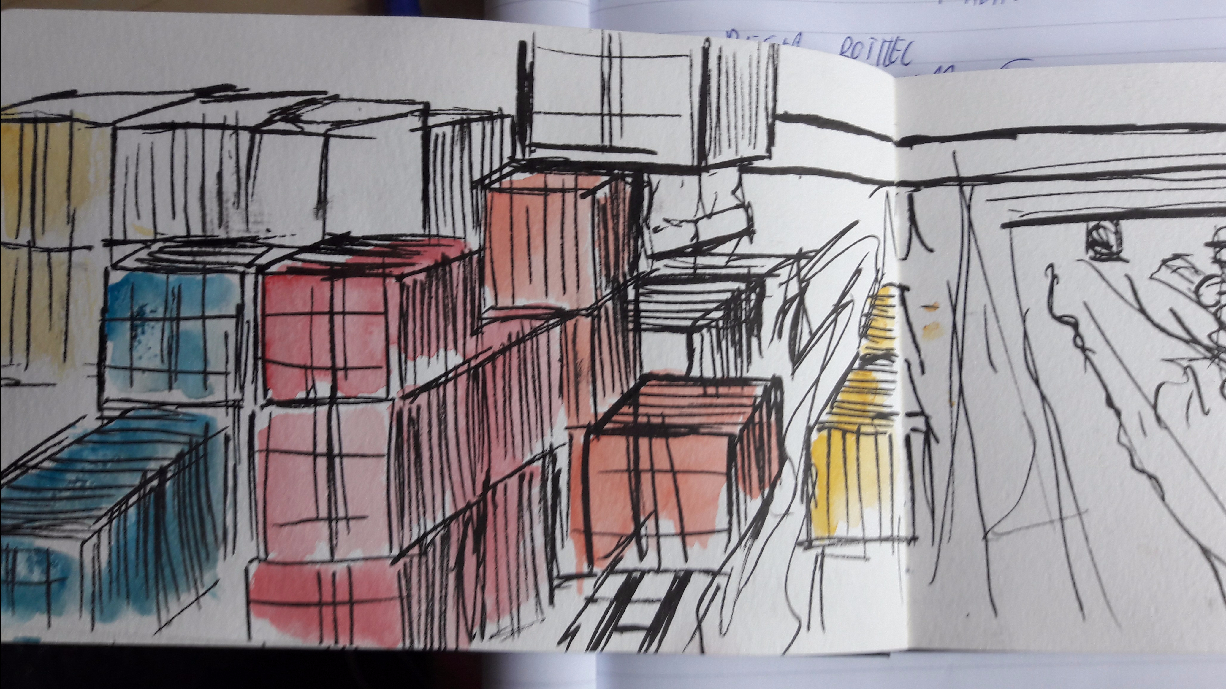
These pieces were for reference of shipping crates and loading areas, landscapes I could use in both the industrial and residential pieces. The main thing I took from this was how shipping containers seem to be piled up randomly rather than evenly, probably because different amounts of the same thing are organised together. It led me to make my shipping container towers more randomly laid out rather than clean and organised giving a more varied silhouette.

20170626_183610

20170626_183543

20170626_183551

20170626_183604

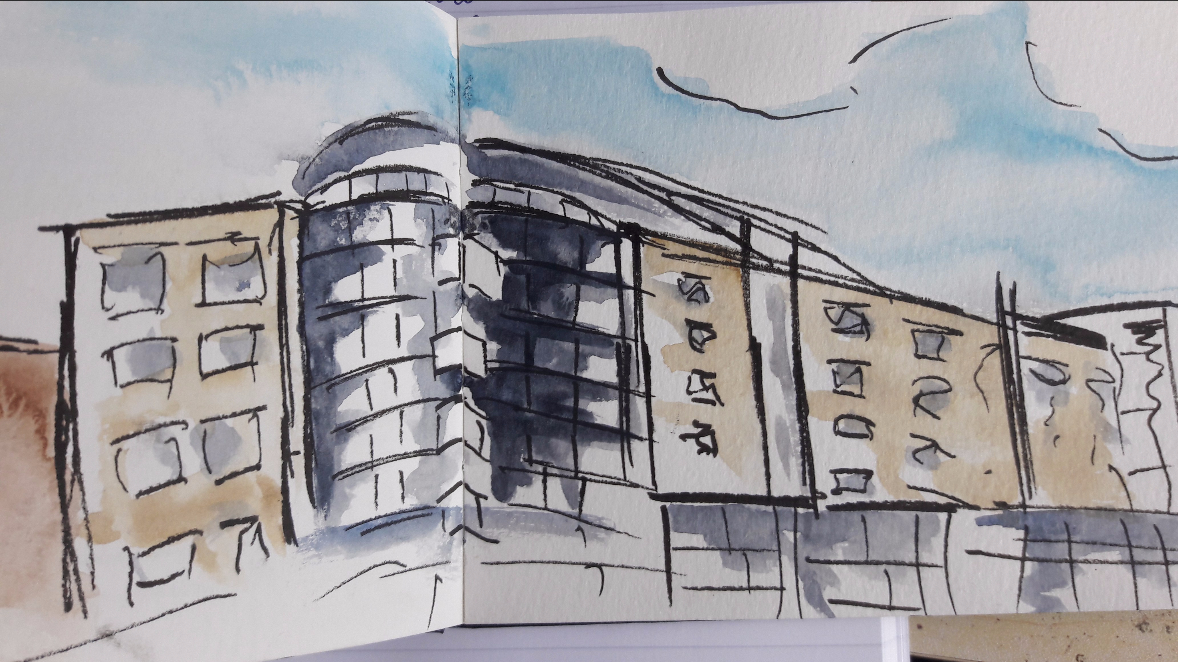
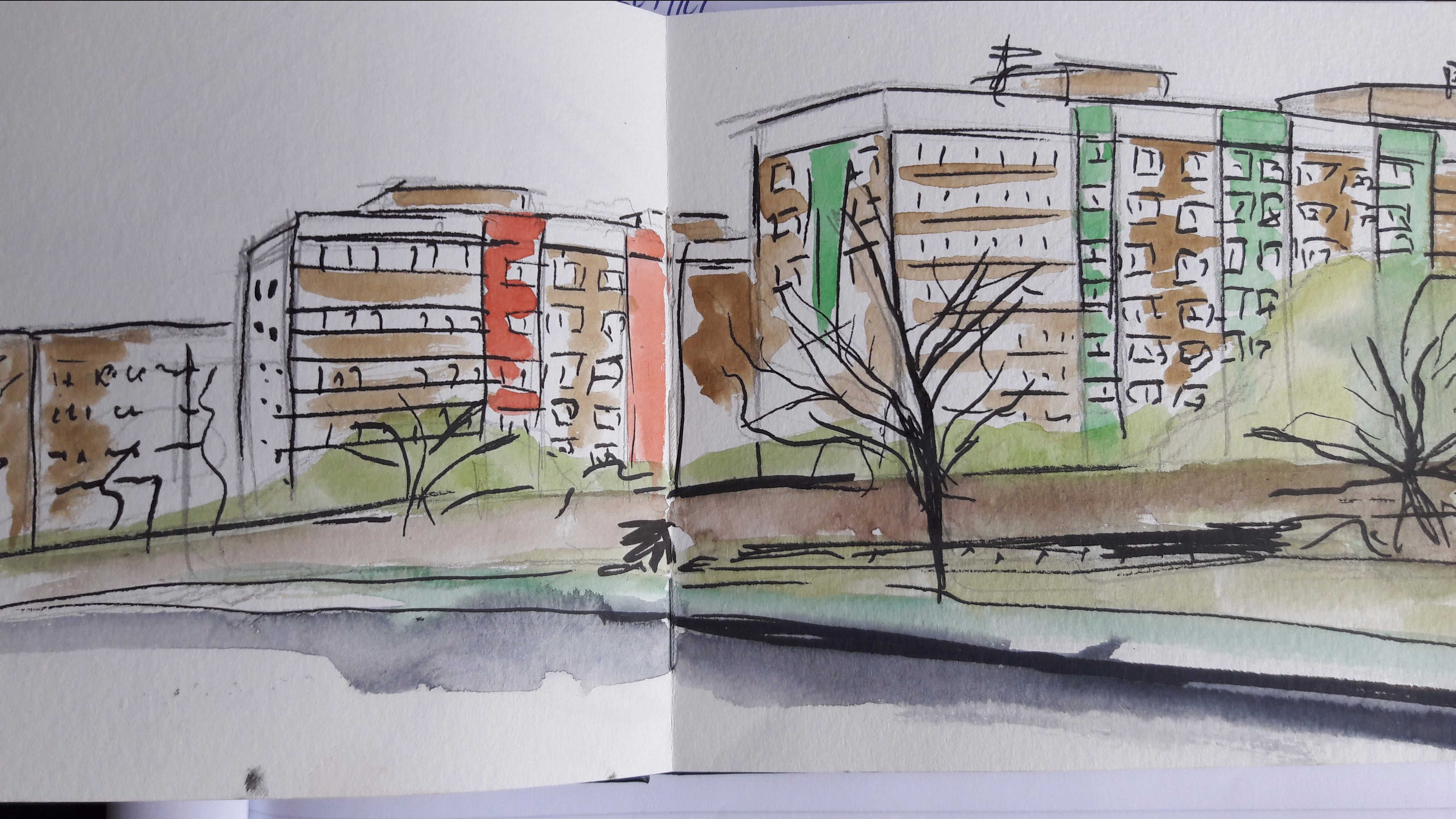
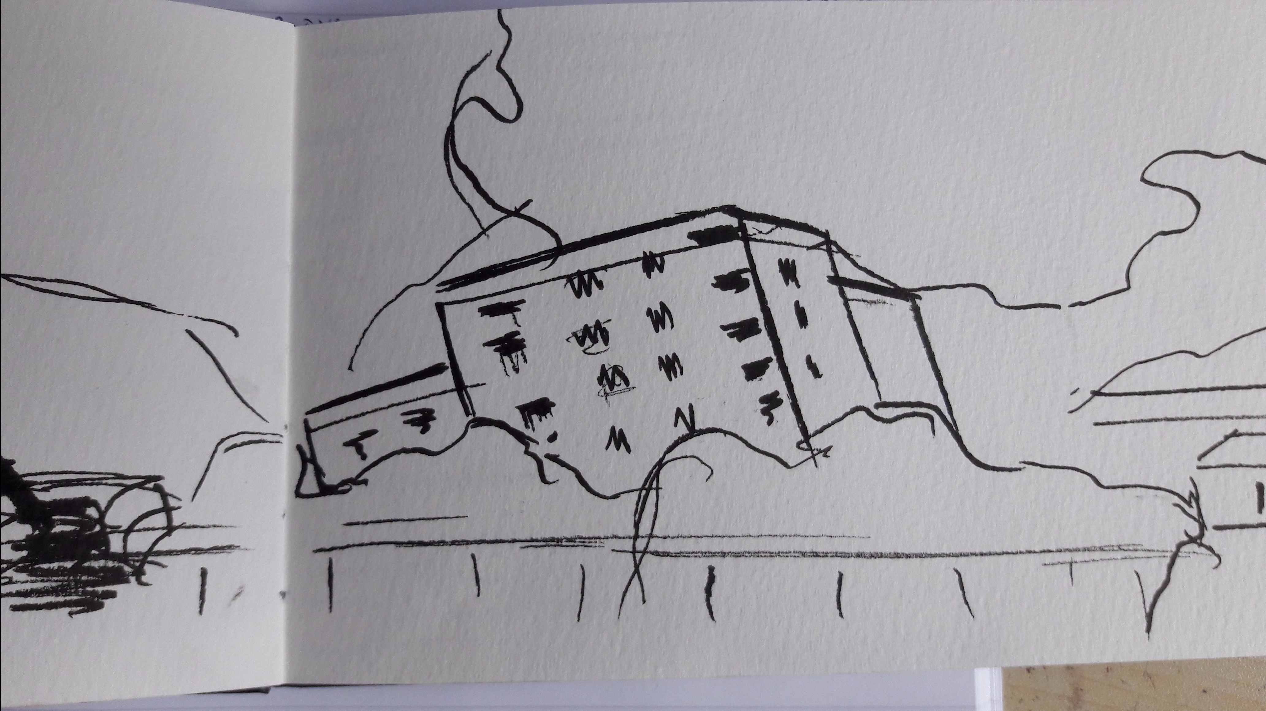
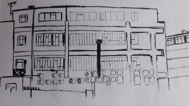
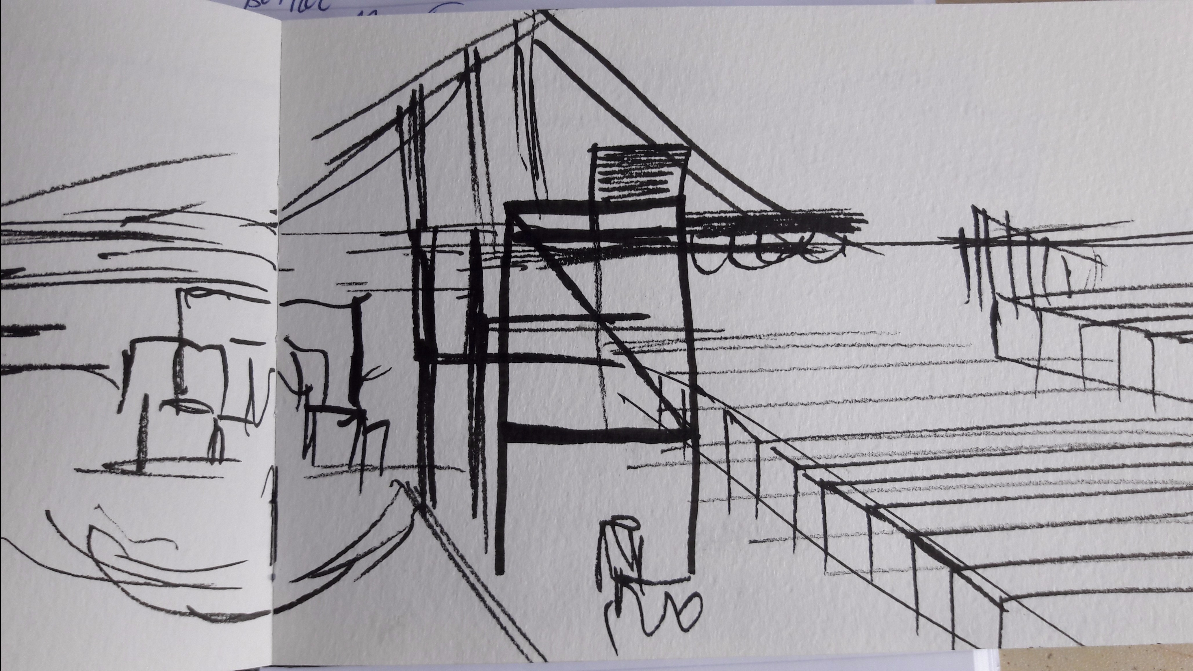
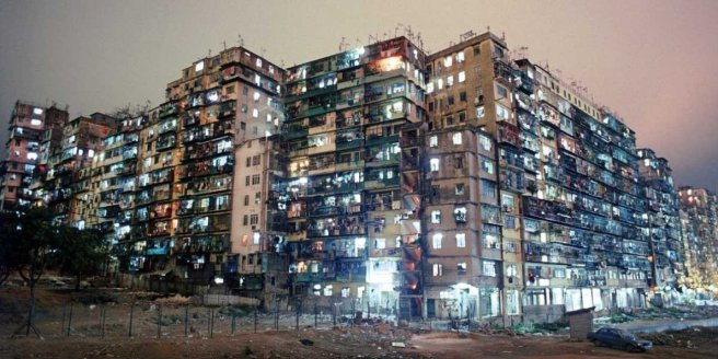
These three pieces were based off of different shaped tower blocks and residential areas to live. These studies were so that so that the towers in my piece were varied and not just a bunch of flat rectangles with windows on them. I wanted to find details to make them look a little individual and some shapes to add to them. The second image was taken from a photograph of a flat being demolished. The smoke when I drew it looked a bit like the building was half buried in rubble. I used this on the lower part of the city to suggest that the lower down you are the more squalor you live in.

These last two pieces were just sketches of possible patterns to add on windows and walls. The left one I did after the final pieces were made as an idea for a future piece to make a building front of lots of different varied shapes rather than the standard layout of grid windows.

Cities of Tomorrow Original images

city tower industry edited

91296d8e263230860495daccace7be48.jpg

These two images were originally going to be the final pieces for this brief however when I finished them I looked at other recent work I did and decided that I could do better. My problem with these pieces is that they look a little washed out colour wise and the linework looks exactly the same as my rough work in places. Not wanting to waste the time I spent on these pieces I used the outlines as templates for the new final pieces.

20170513_193647

When parts of the piece were coloured I thought it would turn out better but on the finished piece I thought the problem was that everything got a little lost because of how packed it was. Whilst I wanted the piece to look like a really built up city I still wanted areas of it to be distinguishable from each other. My way of using water colour made this difficult. Something else I could have tried in hindsight could be to make the line weight more varied, something I didn’t think  about til afterwards.

residential towe no detaiksr.jpg

9ff7639530044c2c6a3979dfeae287c5


Before adding details I did a vector piece of just the outlines of the buildings in different colours to make sure the individual buildings were easier to distinguish. I think these pieces also work quite well on their own but prefer them with the details added afterwards which make them look busier like people actually live in the city.

Theo Prins artist research

Theo Prins is a game concept artist, known for his work on a lot of the Guild Wars 2 artwork. His brush work is done digitally in photoshop though he says he does a lot of brainstorming and development in pencil. The structures he makes are often of a huge scale, at least relative to what we are used to or other more ‘realistic’ fantasy worlds.

theo-prins-2

A close up on someofhis pencil work shows a lot of exposed pipework and worn out walls and damaged streets. If you break down his work you can see a lot of simple shapes being used to make up the full image and a varied shapes within the images used which, to me, differenciates between different parts of the work well, giving the eyes set areas to focus on.

He caught my eye because of the details he puts into the side of buildings. I’m always looking for additional ways to make my buildings look more interesting but after a while you feel like you are reusing the same shapes. Looking at his work and looking at existing architecture is good inspiration.

Jennifer Maravillas Research

jenn-maravillas

I stumbled across Jennifer Maravillas whilst I was looking up the Kowloon City; the above image is her interpretation of it. By building up each persons small part of living space and making them distinct from each other bycolour and texture she has shown the vast number of people who lived here and how overpopulated it was.

jenn-maravillas

Her other architectual pieces depict flattened archictecture of a city or multiple cities, creating a composition of a wide selection of buildings in a small composition. It looks like a good way to create a map or layout an area as a whole.

The idea of a flatter layout is a way I prefer working. I find it allows me to fit more detail into a smaller space making a piece more intricate. Whilst you are limited with the sort of perspective and in some cases how you represent certain shaped buildings, I find that the extra buildings add something in replacement.

Kowloon Walled City Research

I’ve been looking at real life examples of a lot of people living in built up cramped conditions. An example I found is the Kowloon Walled City in Hong Kong. The city was built upon the remains of large unoccupied Chinese military fort and was left largely ungoverned when people moved in. This led to high crime rates and poor living conditions. Demolition of the city finished in 1994.

26-photos-of-hong-kongs-chaotic-kowloon-walled-city-once-the-most-crowded-place-on-earth
Shot of Kowloon City from the outside

If we looked at the cities composition we could look at it as a series of crudely put together blocks stacked on top of each other and overlapping each other. Whilst the buildings components are square and rectangular in shape, the overall composition is a lot more abstract as a whole.

20130423-010435-e1366672059332

The designer Adolfo Arranz made this cut-away piece showing what the interior of the structure and what the lives of the people inside may have looked like. It adds a lot more depth to the piece and additional interest to what before was just rows and rows of window and wall. It shows clearer that the city is actually quite colourful, which may be lost on someone viewing it in reality.

The idea of using a cutaway would give more insight into a fictional world that I am creating. Also, if I was using it as an example of a concept piece it gives deeper insight into the world I am trying to create.

Futurism Research

Another movement I am looking at for inspiration on architectual choices is Futurism. Futurism was a movement that denouced celebrating the events of the past and focused on allowing the new modern world and its ideas and technolodies to create and define new art. Futurism came about in Italy by those who felt Italian focus on past culture was particularly opressive.

futurism-2
The Soul of the Souless City (New York- An Abstraction) – Christopher Richard Wynne Nevinson
futurismm
The Arrival – Christopher Richard Wynne Nevinson


Pieces of Futurism art I have found are often very abstract in nature. Whilst the artists seems to work from what they see and know it looks like they have let their imagination run wild, creating what they think things could be or what they could become.
The top image I selected to show on this page features an interpretation of New York as if it is reaching up into the future, the perspective used showing us on a road (or a railway) towards a city on the rise)
The bottom image looks like a celebration of the featured ships journey, maybe as a celebration of what could be achieved with this developing technology.


Brutalist Architecture Research

For the previously named ‘Cities of Tomorrow’ self initiated brief, a good working title, I have begun looking at the sorts of architecture I want to use when drawing out my own cities. Because each city image will be a lot of different buildings clumped together I want to be able to have relatively simple to draw buildings  but want interesting shapes to add interest. I stumbled across Brutalist architecture whilst looking for building designs.

Below are images of sections of the Trellick Tower (left) and the ‘Triangle Housing’ each examples of Brutalist architecture. Brutalism itself originates from the French word for raw to describe the type of material being used, often raw concrete and gradually developing over time to include brickwork. Followers and fans of brutalist architecture often describe it as artwork you can live in because of the functionality though many brutalist structures have been called eye sores and get bad reputations.
This sort of architecture will suit my sub theme because my thinking behind it is the buildings have been ‘towered up’ to make things more functional. The simple, raw design of brutalist structures fits this and the interesting shapes the buildings come is good inspiration.

‘Cities of Tomorrow’Self Initiated

tower-1blue-tower-city

A couple of years ago  I drew these two tower cities. Inspiration for them came from Brazilian slums and Hive cities from a fictional universe. My way of building them just involved putting modern looking buildings and stacking them up on top of each other, condensing a full city into a small space. In the last couple of days I dug up the pictures and decided to revisit them.

revisited-tower-cities

This was a quick sketch that started as me redrawing the tower city but turned into me adding new elements and expanding it outwards a little. The thought process with the design is that it is a city built only on efficiency of space, so those living there cram as much as they can into as little space as possible.
To put this into a brief format the plan is to design the expanded cities and then  design propaganda posters to go with it which encourage people to take and live with less to fit in with the new cities design. It would be a sort of parody of old ‘cities of the future’ themes were people have less to achieve more rather than just everyone living in comfort with more.