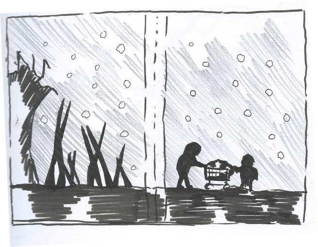
This is a very early rough I made for layout purposes of some even earlier thumbnails I did. The idea of this piece is to have the father son pushing the trolley in the bottom right corner of the cover (possibly scale them down for a nicer composition) The back features a slowly rising tree/rubble line. The foreground would be in silhouette with maybe some detail and/or texture. The pencil shaded area would be a mid tone colour; I’m thinking a grey or a blue. The circles are snow flakes and would be odd shapes and infrequent to make them look natural. Title of the book would go at the top, I have not looked at the sort of font I want to use yet.
Things I like about this draft
- Limited palette and is in the silhouette style I wish to practice/improve.
- Even the empty space will have some small object or texture in it.
- In my opinion achieves the lonely, helpless vibe the characters feel throughout the book.
Things I don’t like
- It is kind of generic, comparing it to the other book sleeves I researched it looks very similar to them. Whilst this does mean it is more likely to fit the theme of the book I can probably be more interesting.
- The objects on the front and back currently end with the same spike up in the bottom left corner. I could make the back so it arches at either side and frames on the blurb space to fix this.
